
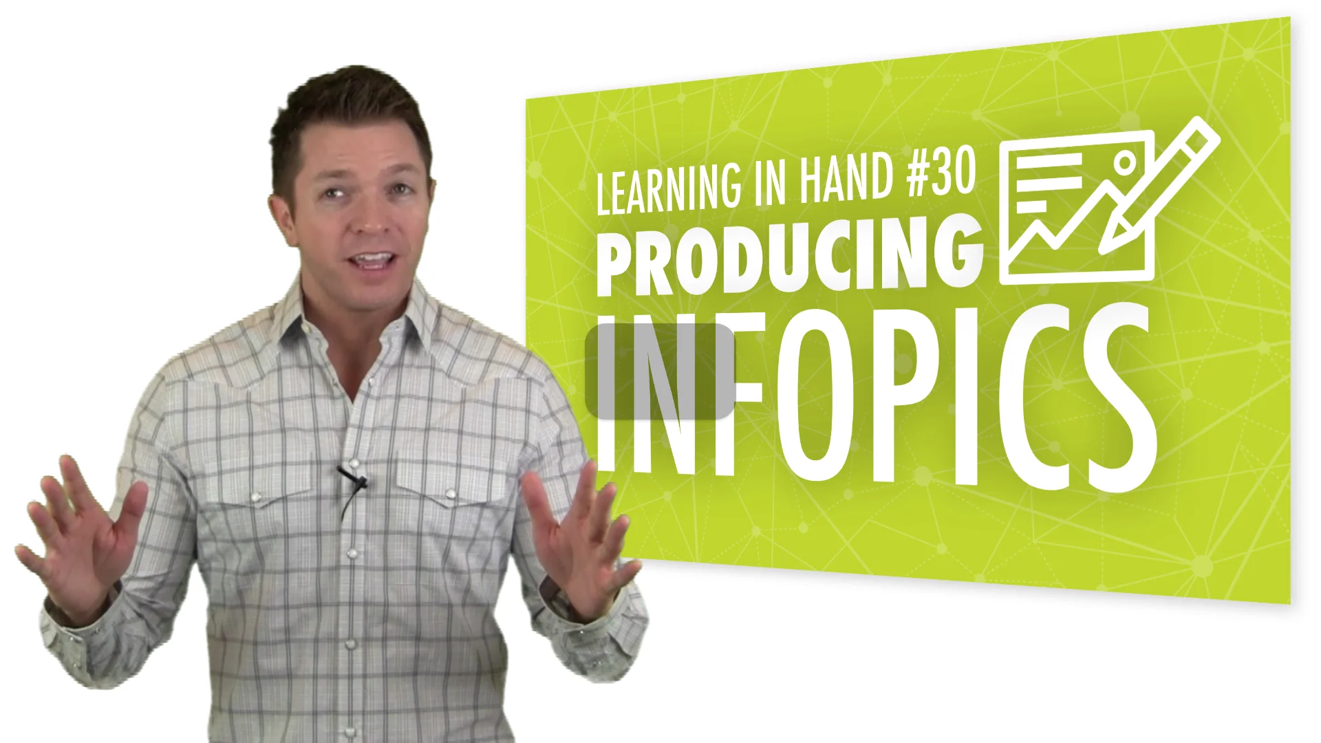
Producing Infopics

Learning in Hand Show #30 is about making infopics. An infopic is a photo with text layered on top that is designed to communicate a message. Watch the video to see examples and to learn about tools and techniques for making your own.
View the 11 minute video on YouTube, on Vimeo, in iTunes as a podcast, through RSS, or as a download.
Video Transcript
This is Learning in Hand! My name is Tony Vincent and this is the show where I share tips, how-tos, and ideas for using today’s digital tools for teaching and learning. Episode 30: Producing Infopics, recorded January 2015, happens now!
You usually remember a photo better than you remember words, right? Visuals are more easily retained in memory than words. Pictures grab our attention faster than text. So how about we pair words with a picture to help us remember and convey information in an appealing way?
For example, I watched Ken Shelton’s TEDx Talk on YouTube. To summarize what he spoke about during the 13 minute video, I took notes. I also took a screenshot of the video. I thought about Ken’s message and the main ideas I personally thought were important. I added text on top of the screenshot and shared the final product on Twitter and Facebook with a link to the video.
I’m calling this type of photo an infopic. An infopic is a photo with text layered on top that is designed to communicate a message. The message might be a summary, quote, definition, notes, data, weblink, hashtag, or other informational tidbits. The information might come from a conference, workshop, activity, lesson, video, book, a conversation, etc.
Infopics are often created on a smartphone or tablet because it’s easy to snap a photo and use a combination of apps to edit, enhance, transform, and annotate the picture. But you can certainly create infopics on a Chromebook, laptop, or desktop computer.
I’ve been inspired by Jonathan Nalder. He does some incredibly artistic iPhonography, and he shares infopics from conferences he attends. He’ll take a photo of the speaker or of something from the conference, enhance the image, and add text.
Jonathan likes to use the Mextures app on his iPhone to add textures, light, and color effects to his photos. And he might use the Over app (iOS and Android) to add text to the image he saved from Mextures. Follow Jonathan on Twitter or Instagram.
The process of creating an infopic forces you to listen or read information and decide what is most important to remember and share.
Learners of any age can make an infopic. Let me show you some tools and techniques I use for making infopics.
Skitch is an app you might already know about and use. It’s great for adding words to an image, and that’s because any text you add has a thick black or white outline. This keeps the text readable, no matter what it is behind it. Here’s an example. You can also add arrows and annotations to your photo. Another nice thing about Skitch is that is available on lots of different platforms, including iOS, Android, Fire, Mac, Windows, and Chrome.
Pic Collage is a another Android and iOS app you might already be familiar with. You can combine multiple photos. When you add text, you will probably want to have it outlined in a contrasting color for readability. If you are adding a text box with lots of words, try giving the textbook a background color. It’s ok if your text boxes are askew. But if that bothers you, shake your device to straighten everything.
Pic Collage makes all it’s photos in portrait orientation. Those won’t work so well for Instagram. If you don’t place any text at the top of bottom regions of the background, you can always crop the image after you’ve saved it to your Photo Library.
And while square images are what’s needed for Instagram, landscape images are better for Twitter. That’s because of how Twitter crops tweeted images. Create landscape images in Pic Collage by rotating the photo and text. After you save the image, open it and rotate it.
Like many photography apps, PicLab for iOS and Android has filters. The Vignette filter can darken the edges of your photo, providing more contrast for white or light colored text.
And like many apps, PicLab has an assortment of fonts. Your font choice is important. You’ll want to choose fonts and colors that are legible when layered on top of your photo. Fonts and colors convey the tone of your infographic, so be sure to consider how your choices affect the message.
Another consideration for fonts is the available space on your photo. You may need a tall skinny font if that’s what will fit.
When you snap the photo for your infopic, be sure to leave space where you can add your text. Don’t get to close to the person or object you are photographing. Visualize where you could put text and adjust how you frame the photo. You might want to leave lots of space to the left or right. Or maybe you imagine putting your text at the top. If you can, snap a series of photos, each with different framing. Then you’ll have options for your infopic.
I made the infopic about Ken Shelton’s TEDx using Phonto (iOS and Android). I scrubbed through the video to find a frame that would have room for the text I wanted to add. Then I took a screenshot, which I brought into Phonto. I like that I can add shadow to text for readability. And consider changing the Alpha, which is the text’s transparency. Having partly transparent words can be stylish.
Want your words to follow a path? Try Path On for iOS. You simple draw a line where you want your text to appear. Path On gives you font size, letter spacing, and shadow options.
Check out this effect: you can turn a photo black and white and then choose to add color back to portions of the photo in with apps like Color Effects for iOS or Color Splash Effect for Android and for Kindle Fire. Colorizing a photo a great way to provide focus. Also, a black and white background can make your colored text easier to read. Here’s a tip: When you go in to recolor parts of your photo, be sure to zoom in so that it’s easier to get close to edges.
Thinking of apps you are already familiar with, slideshow software like PowerPoint, Keynote, and Google Slides can certainly be used to make infopics. In fact, slideshow apps have lots of great options for text and effects. And a little hint—if the app doesn’t support exporting your slide as an image, simply take a screenshot of the slide in full screen and you’ve got yourself an infopic.
Pixlr is a mobile app (iOS, Android, Fire) and web app. It has some really great textures you can add to embellish your photo. It also has some useful effects, like Focal. The Focal effect can be radial or linear and you can control how large it is. You can add blur to busy backgrounds so that it’s not distracting from your photo’s focus. And, the blurred part of the photo is a great spot to put your text for easier readability. Pixler also has the Splash effect where you can change the photos to black and white and recolor parts of it.
You might want a person or specific object in focus while the rest of the photo is blurred. There’s probably a simpler app for this, but I use Photoshop Touch (iPad or Android) to cut out a person. I add the original photo back in as a bottom layer, but I blur it. I like how it really makes what’s not blurred look like it’s floating.
There really are hundreds of apps that you might use to make an infopic! Visit learninginhand.com/infopics for links to apps and to see more infopics.
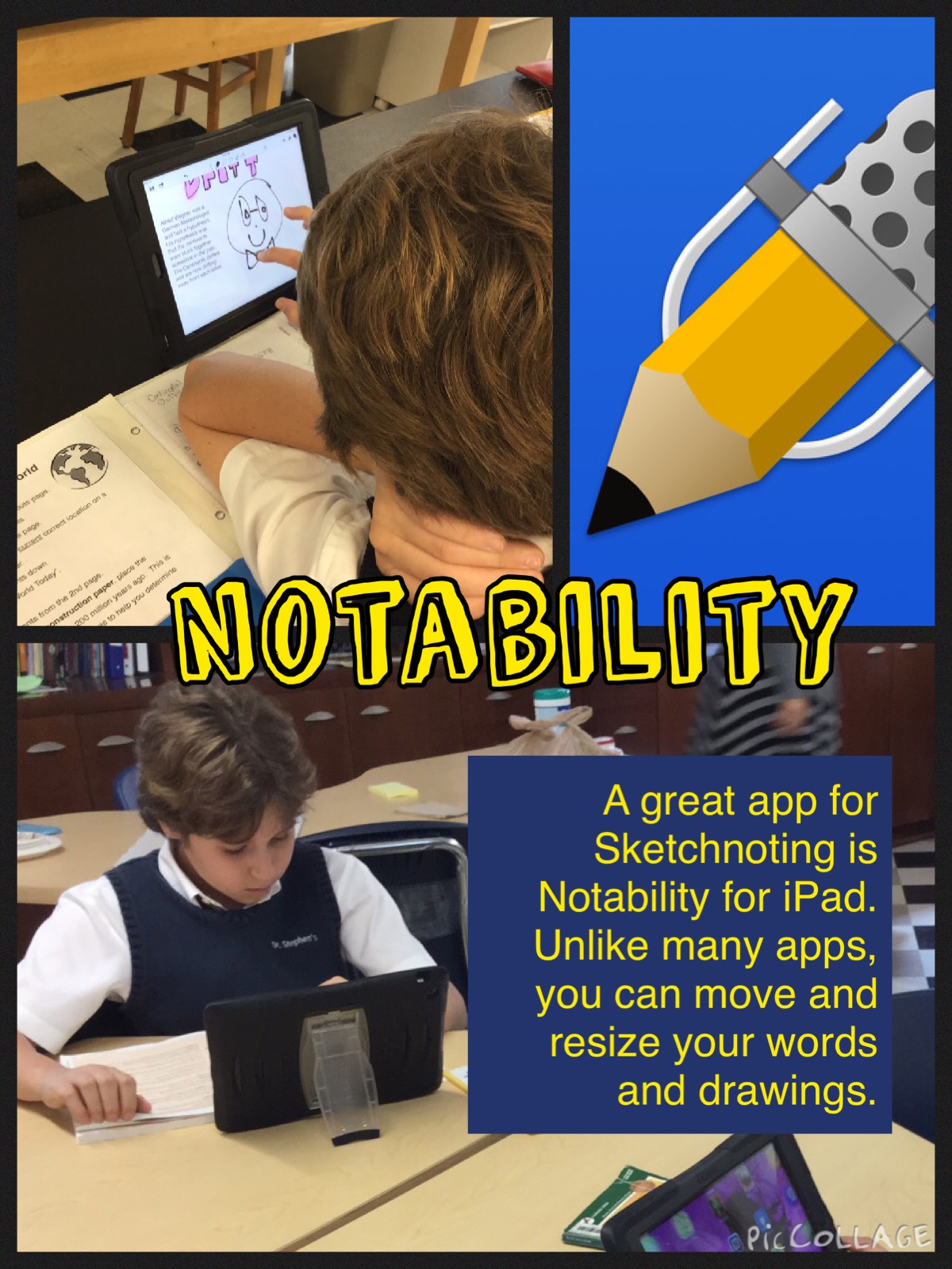
So why produce an infopic? The creator of the infopic gets to process their learning and turn it into something memorable. The infopic can be saved in Evernote, OneNote, Notability, Google Drive, or wherever a learner might keep notes. It’s more fun to look back at my notes from a conference I’ve attended when I’ve included infopics.
And, if an infopic is posted online, the audience for the infopic gets to learn something in a quick and memorable manner.
Posts that are photogenic get more attention on social media. Educators can use this to their advantage when communicating with students, parents, and each other.
When I taught 5th grade, my favorite daily activity was having a student roving reporter who took photos and wrote an article about what we learned that day. Now, as an alternative, what if each day or each class had a student assigned as the photographer whose job is to create and share an infopic from the lesson? By the end of the school year, the class would have a nice collection of infopics! And a great place to collect them would be on a blog or a Padlet wall!
The best infopic advice I can give you is to practice and experiment. Infopics can be simple or complex. They an have very little text or quite a bit. They can take a couple minutes to produce or can take an hour. I think producing an infopic is time is well spent. So go out and be artextic!
That’s it for Episode 30. Check out my website at learninginhand.com and find me on social media (Twitter, Facebook, Pinterest, Google Plus). Thanks for watching!